Quick start
This quick-start tutorial aims to guide the user through the NormSeq platform using the provided example tRNA expression dataset that consists of mouse tissue samples from the GEO dataset GSE141436.The dataset consists of a tRNA-sequencing raw counts matrix, at tRNA isodecoder level, of 21 different samples from seven mouse tissues, derived from the central nervous system (CNS), liver, tibialis and heart mouse tissues.
If you use the test dataset, please cite the following publication:
Pinkard O, McFarland S, Sweet T, Coller J. Quantitative tRNA-sequencing uncovers metazoan tissue-specific tRNA regulation. Nat Commun. 2020 Aug 14;11(1):4104. doi: 10.1038/s41467-020-17879-x. PMID: 32796835; PMCID: PMC7428014.
INPUT PAGE
1. Open the NormSeq Query page
Access to the NormSeq Input page (here)[https://arn.ugr.es/normSeq], or selecting "Try it" or "Use NormSeq" links on the NormSeq homepage.
2. Select the RNA class of interest
To run this example you need to select the tRNA class.
3. Load example data
Upload the example dataset to the web server by clicking “Load Example Data”. This automatically provides the URL links to the data of the “Input Matrix”, with the raw counts matrix of this dataset, and the “Annotation File”, where the samples and the different groups are defined. NormSeq informs the user as soon as the data is loaded on the webserver.
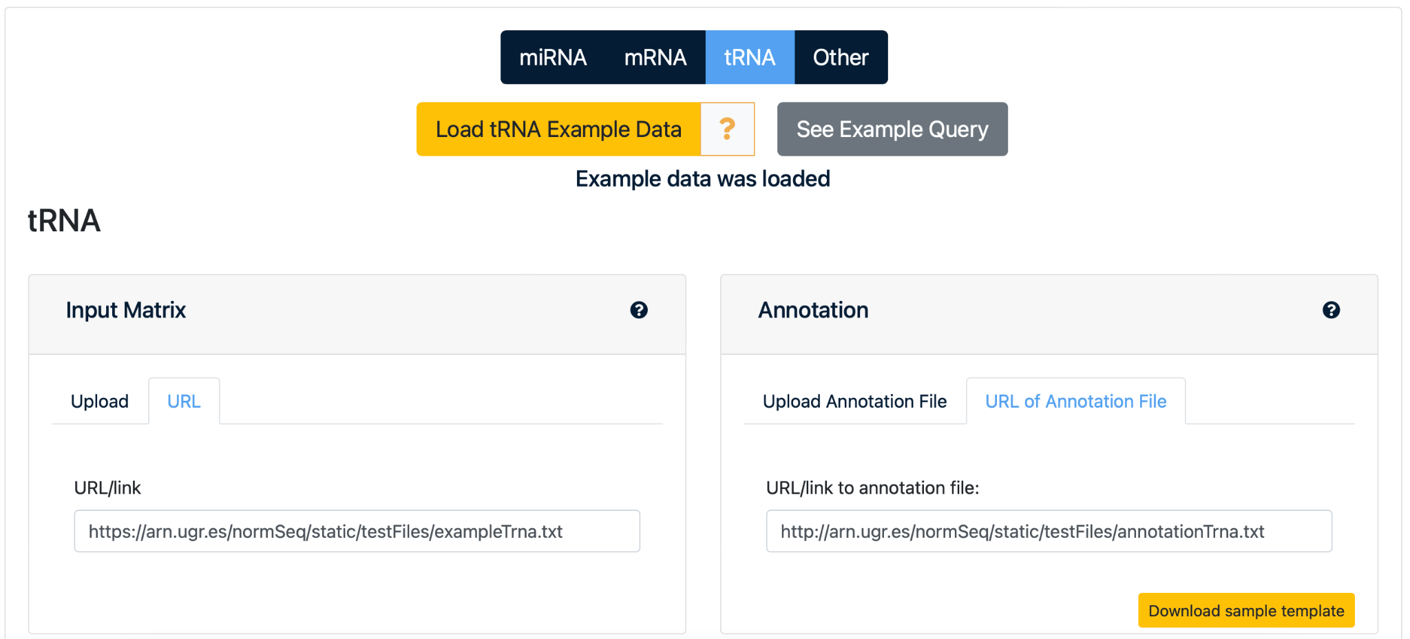
NOTE: You can also select “See Example Query” to immediately go to the output page with normalization and visualization results for this test dataset.
4. Selection of data normalization method
By default, all options for data normalization are automatically selected, namely “No normalization, just visualization”, “Counts per Million”, “Upper Quartile”, “Median”, “TMM”, “Quantile” and “RLE”. Click “Reset” button just below the normalization methods list to remove all selections and click the box of each normalization method that the user wants to use for the analysis.
5. Selection of parameters
Minimum Read Count (RC): The minimum read count to consider a RNA in the analysis will be set at 0 by default, but it can be adjusted manually for more extrict analysis. Differential Expression Analysis: By default the differential expression analysis will be performed. It can be omited and the FDR cut-off can be adjusted
6. Launch the analysis
Select the ”SUBMIT” button to start analyzing the example miRNA dataset on the NormSeq webserver.

10. Status page
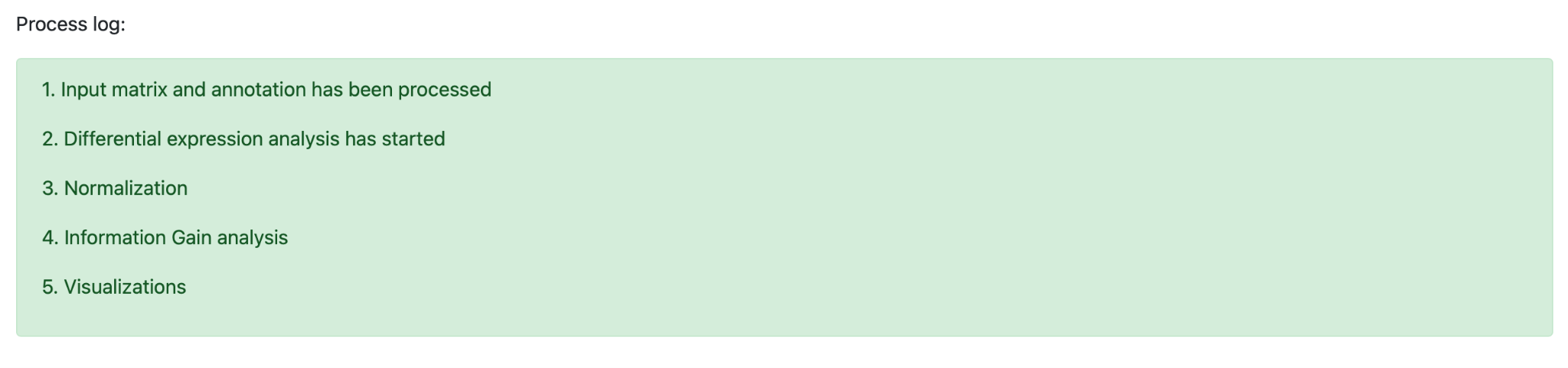
The analysis of the example tRNA dataset is initiated and a unique Job ID for the analysis run is automatically generated. Select “bookmark this page” to be able to retrieve or share your data normalization and visualization results within 15 days after processing the data.

The web page will be automatically refreshed every few seconds to allow the user to follow the progress of the normalization analysis via a process log while processing the data.
OUTPUT PAGE
1. Overview of results
Results for each Job ID are provided on the output page in four different tabs, that allows the user to explore the normalization results in a step-wise manner.

2. Summary - Normalization selection
By default, the first results in the summary tab include the “normalization selection” that helps the user with the selection of the most optimal normalization method for downstream analysis. The visualization is divided into two plots.
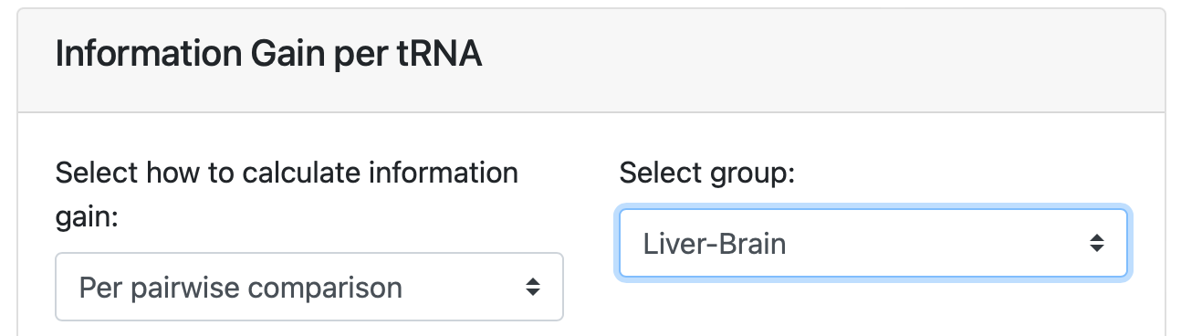
The first plot that can be accessed is the information gain that informs the user about the noise reduction for each normalization method. It has a value between 0 and 1 that reflects the reduction of entropy from transforming a dataset with a specific normalization method. It has a value between 0 (higest impurity) and 1 (lowest impurity), and therefore, higher values of information gain would represent a clear separation based on the biological groups for that feature.
NormSeq offers the information gain distribution for all chosen normalization methods in two formats: for each pair-wise comparison and for each individual group. Click “ on the arrow below “Select how to calculate information gain:” to hover between the options “Per group” and “Per pair-wise comparison”. Select “Per pair-wise comparison” and then select “Liver-Brain” that is listed below “ Select group:” to visualize the performance of all normalization methods.
Click on the plot to enlarge the visualization of the results. While the enlarged plot is loading, you will see a timer pop-up when the loading takes longer then expected.

The enlarged version of the graph has several additional actions.
A) Hover over the graph to see the values that match each sample. B) Click on the camera in the top right corner to download the plot in .png format. C) Click on the magnifying glass for zooming in a selected area within the plot. Select with the cursor the area of interest in the plot for zooming in. D) Click “+” or “-” to generally zoom in or out the entire plot. E) Click the arrows to move along the Y-axis F) Click on the house pictogram to reset the plot to the original settings. G) Click “close” to go back to the results on the output page.
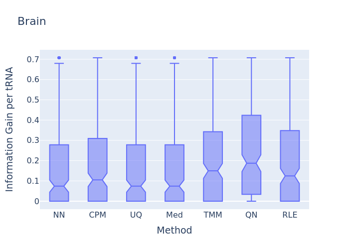
In this information gain distribution plot, the information gain per tRNA distribution is displayed. In this example, the Quantile normalization has the highest distribution. This would imply that according to that normalization method more information about the Brain samples as compared to the others tissue can be retrieved back, so this should be the selected normalization method for the current dataset.
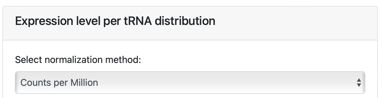
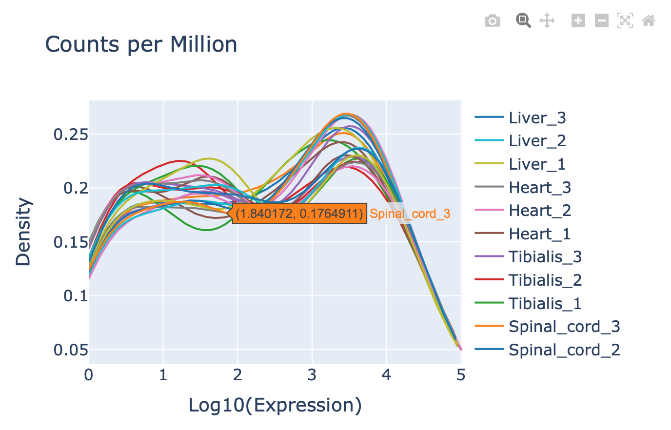
You can also access the second plot “Expression level per tRNA distribution” to see the distribution of tRNA expression in the dataset. This is a reflection of the expression levels of the different RNAs in each sample. Distributions between groups need to be comparable in order to increase the probability of correct biological inferences for further downstream analysis.
Hover over the arrows and select normalization method: “Counts per Million”.
Similar graph actions can be performed as before (see output 2A to 2G).
3.Summary - Top 10 expressed RNAs
Select the second tab “Top 10 tRNAs” for basic visualization of the ten most abundant tRNAs in the dataset detected by the normalization method of choice. The user can simply hover over the arrow to select the results for each normalization.

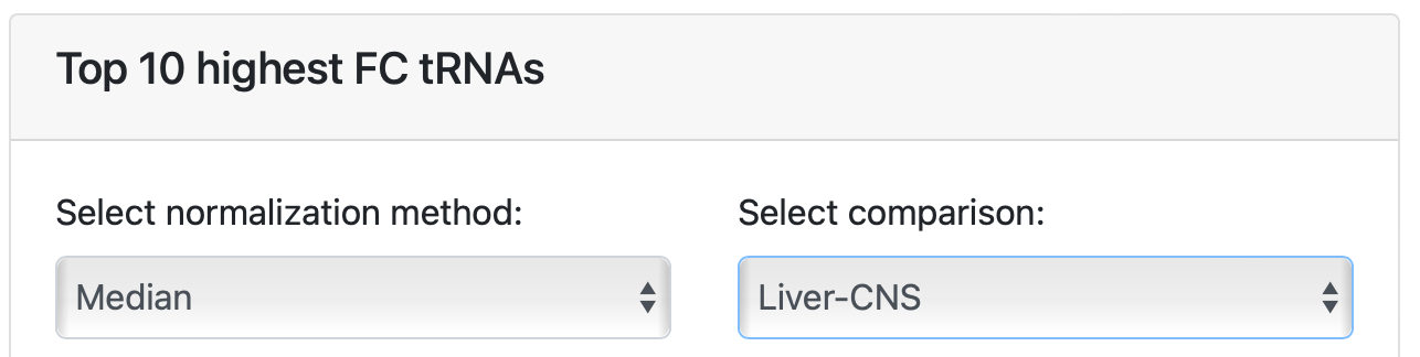
The second plot in this section can be used to see the highest fold change (FC) between the two groups groups that were created in the annotation sheet from the example dataset. Again, hover over the arrows at “select normalization method:” and click “Median” to select the appropriate normalization method for visualization. Hover over the arrows at “Select comparison:” and select “Liver-CNS” to plot the graph. Similar graph actions can be performed as before (see output 2A to 2G).
4. Visualization: heatmap, PCA and per feature plots
The visualization tab is divided into three sections.
Section one contains hierarchical clustering analysis that visualizes side-by-side similarities or dissimilarities between samples for each chosen normalization method.
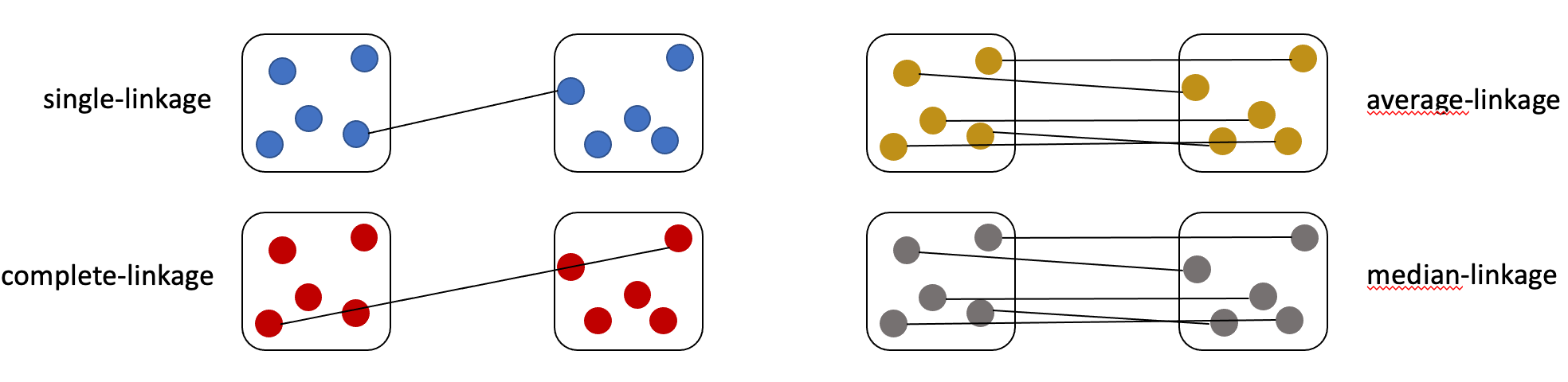
Click on the heatmap to enlarge the figure and get a detailed overview of the results. The user has several options for plot alterations related to “method” and “scale”: a) method: Single. Single-linkage clustering computes the minimum distance between clusters before merging them. b) method: Complete. Complete-linkage clustering computes the maximum distance between two clusters. c) method: Average. Average-linkage clustering computes the average of all distances between members of two clusters, resulting in more homogeneous clusters. This clustering method is most widely used in hierarchical clustering algorithms. d) method: Median. Median-linkage clustering computes the median of all distances between members of two clusters.
The rows and columns can be arranged according to the hierarchical clustering.
e)scale: Row. Centers and scales the clustering row-wise by genes. f)scale: Column. Centers and scales the clustering column-wise by sample. g)scale: None. No scaling is performed.
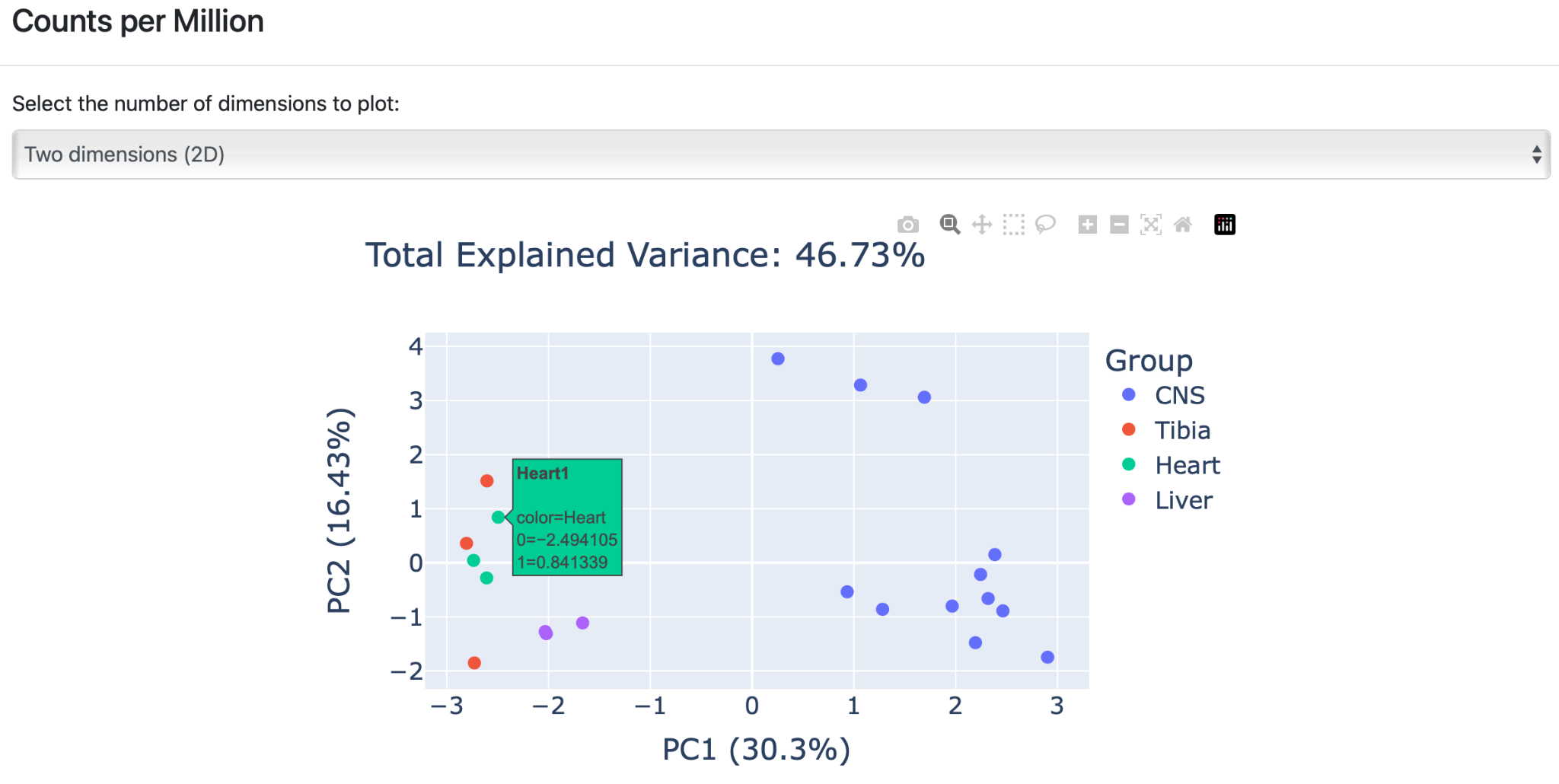
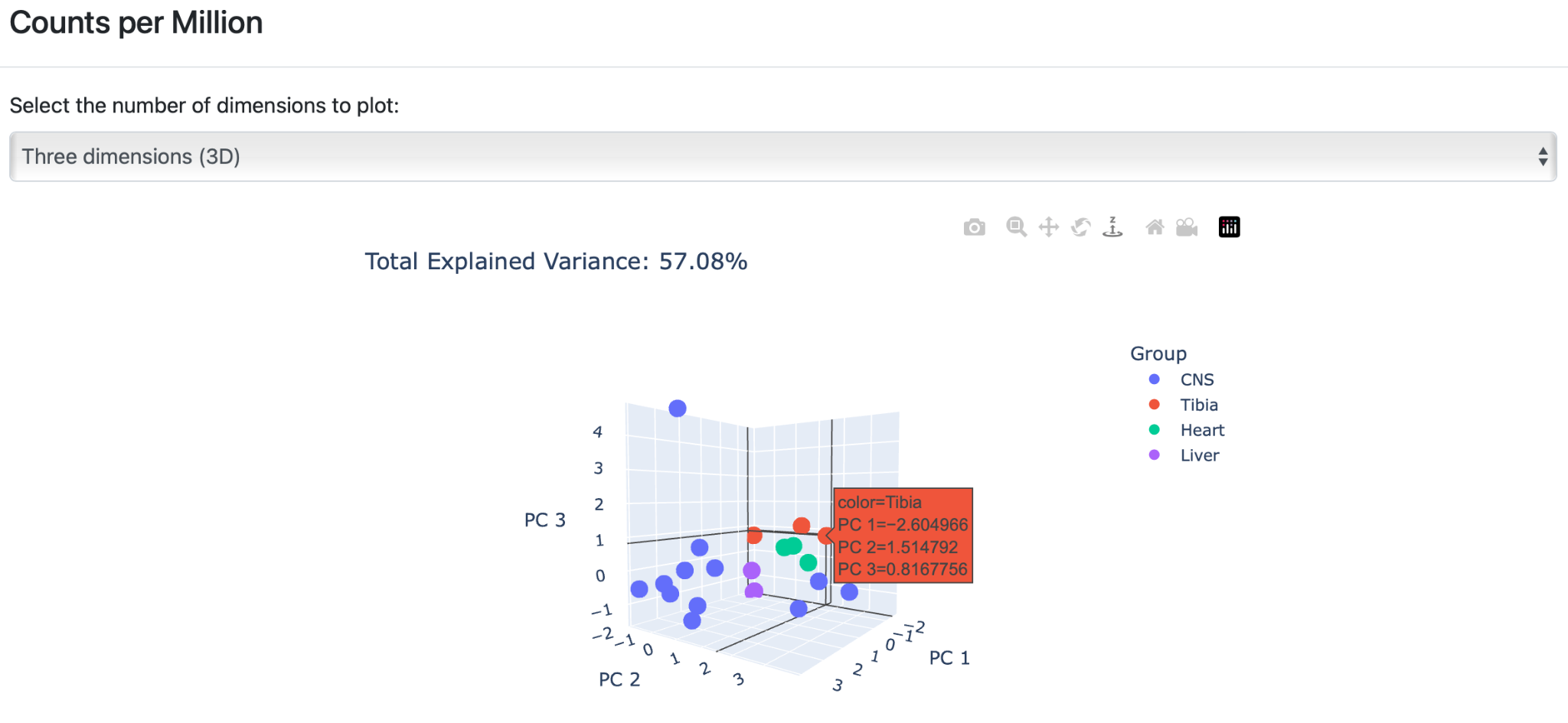
The second section contains principal component analysis (PCA), which is a very flexible tool that reduces dimensionality while preserving as much as possible from the information of the dataset. Again, PCA plots show results for all analyzed normalization side-by-side.
Click on the PCA plot to enlarge the figure and get a detailed overview of the results. Each group is represented by a different color. The user has two visualization options by hovering over the arrows in the plot. The plot can either be viewed in “ two dimensions” or in “three dimensions”.
A) Two dimensions (2D): The PCA plot is created as a 2D scatter plot based on the two most descriptive principal components. Similar graph actions can be performed as before (see output 2A to 2G).
B) Three dimensions (3D): The PCA plot is created based on three components that can be employed when the sum of the two variance ratios in the 2D plot is very low. This PCA plot provides a visibly higher variance ratio percentage of the dataset features.
Click on the graph to enlarge the visualization of the results. The enlarged version of the graph has several additional actions, similar to output 2A to 2G. Click the arrows to rotate the plots around their three axes to get more detailed insight into the generated clusters.
The third section contains per feature plots. By default, “nothing selected” is indicated. Hover over the arrow next to “Select tRNA:” and a list will appear with all features in alphabetical order.
Either scroll through the list of features or type: Arg-TCT-4-1 to get the corresponding plot for all selected normalization methods.

5. Differential Expression
Differential expression (DE) analysis takes the normalized data for each normalization method for the discovery of quantitative changes in expression levels between experimental groups. The “Differential Expression” tab is divided into three sections.
Click on the first section “Summary” to get an overview of the performance of each differential expression analysis protocol. Four different protocols were used for DE: A) EdgeR: The EdgeR protocol is a parametric method assuming no differential expression based on negative binomial distributions. The protocol was developed to analyze experiments with a small number of replicates. B) DeSeq2: DESeq2 is a parametric method assuming no differential expression based on the same negative binomial distribution as EdgeR. DESeq2 uses a geometric normalization strategy. C) NOISeq: NOISeq is a nonparametric method that empirically models the noise distribution by contrasting absolute expression differences and fold-change differences among samples within the same group. D) T-Test.
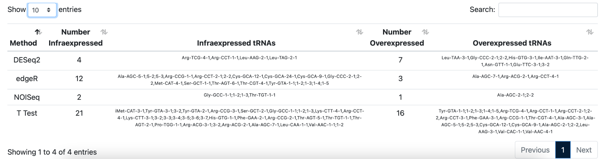
Hover over the arrows to make the selection for differential expression analysis. Your selection is also highlighted and an overview of the amount of under,- and over-expressed tRNAs is generated for all protocols.
Click on the second section “Results per method” to explore the differentially expressed genes in more detail for each given differential expression analysis protocol.
Hover over the arrows to change the comparisons and DE protocol that is used for the analysis. Click “Heart-CNS” and “DESeq2” for DE analysis. Click on the arrows at “Show 10 entries” to change it to 25 entries. Click on the arrows to change the order from “low to high” into “high to low” for any of the columns to explore the dataset.
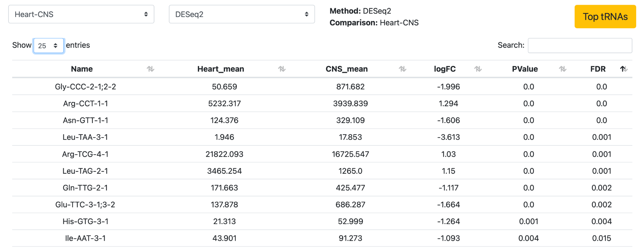
Next, click Top tRNAs to get an overview of the top 10 differentially expressed tRNAs.
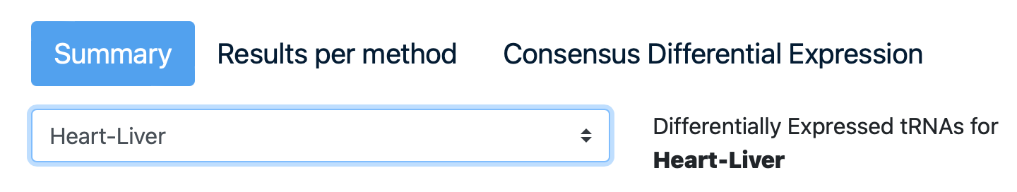
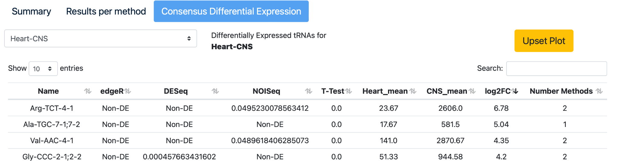
Click on the third section to see the “Consensus Differential Expression”. Click on the comparison “Heart-CNS”, click on the arrows of the “log2FC” column in the table to arrange the data from high to low.
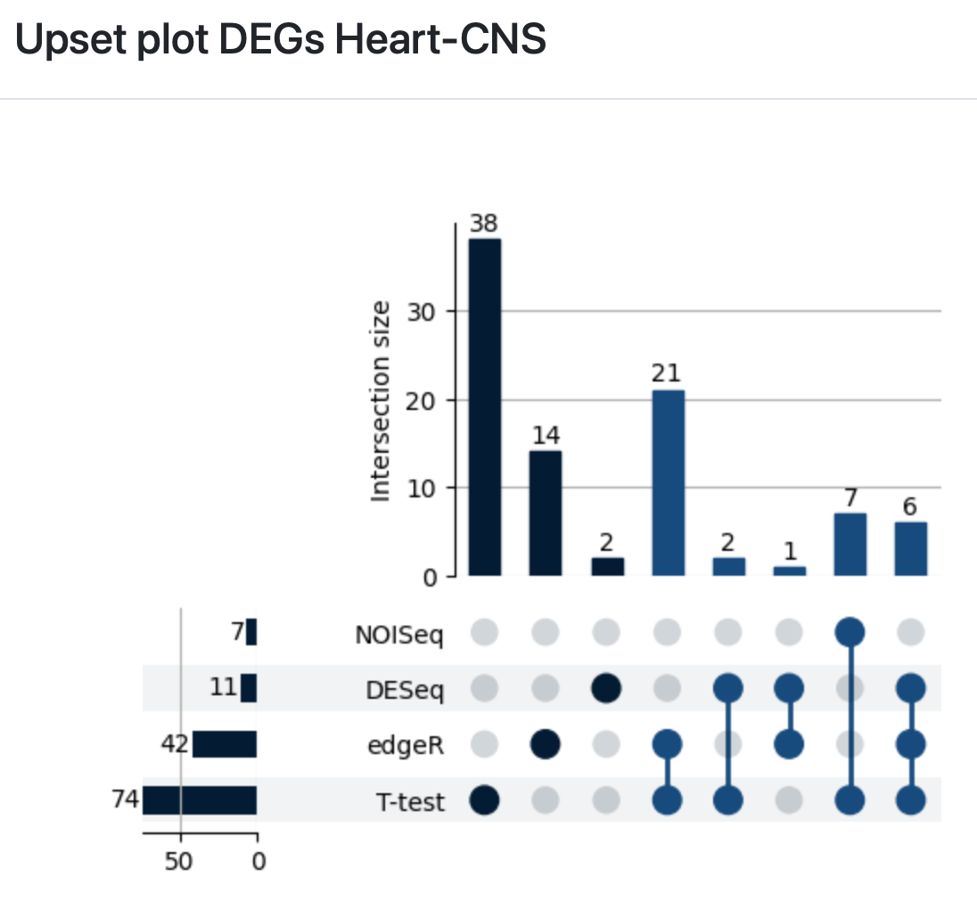
Select the “Upset plot” to review the intersection of differentially expressed tRNAs detected with edgeR, DESeq2, NOISeq, and a Student’s t-test.
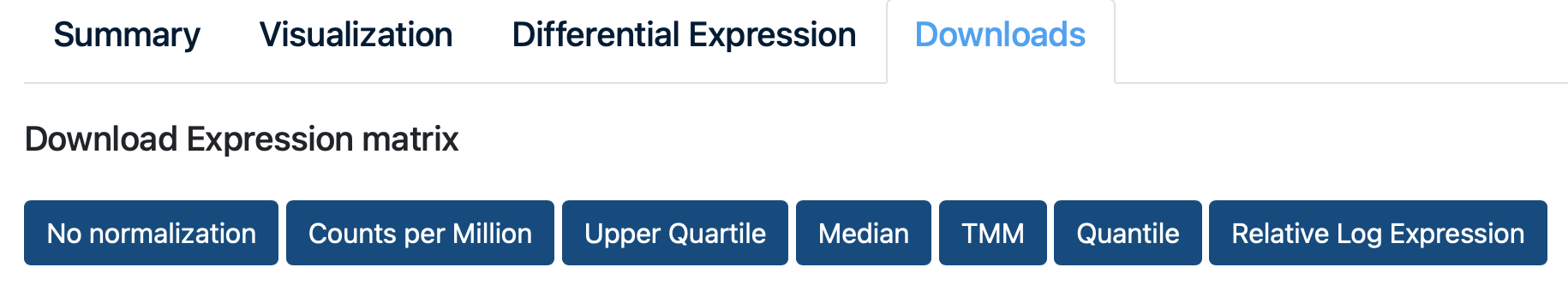
6. Downloads
Finally, click on the normalization method of choice to download the expression matrix that is created after normalization of the example data.